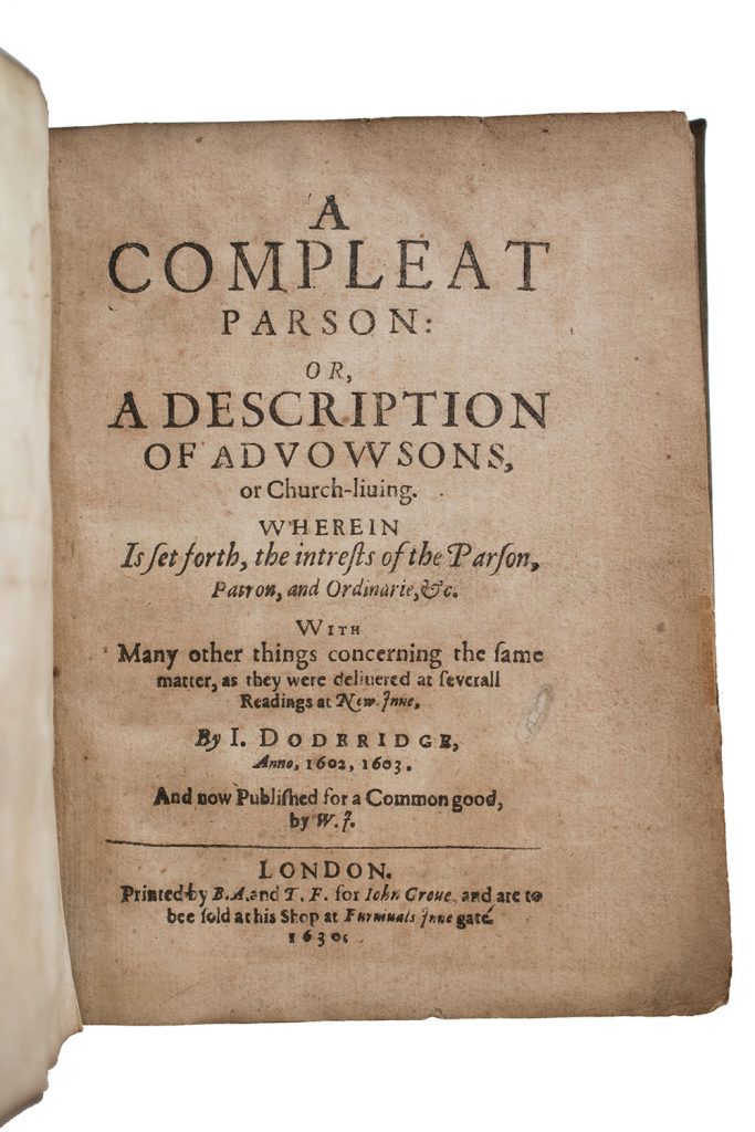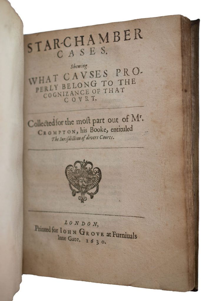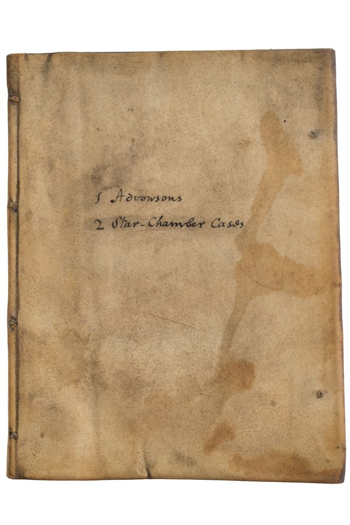
From the outside, this looks like a standard parchment binding. As the inscription on the cover indicates, it brings together two different titles. Yes, it’s what book types call a sammelband. John Grove published both editions in 1630:
In the picture of the front cover, you can see the stubs where there were once two alum-tawed ties at the fore edge, just as you’d expect. (Silk ties would have been another possibility.) And you can see on the left that the parchment case is attached to the bookblock with alum-tawed strips at four points in the front, and if you turned the book over, you’d see that the same four strips are also laced in at the back—again, just as you’d expect.
The main reason I own this book, though, is that the quires inside haven’t been bound, if by “bound” we mean sewn through the folds onto a series of supports. Instead, this is what I call a hybrid structure: the 86 leaves that make up the bookblock have been stab-stitched together at four points, and what look like traditional sewing supports from the outside pass straight through the bookblock just as the stab-stitching does. You can see part of the stitching and a couple of the alum-tawed thongs in the featured image at the top of this post. As in a standard parchment binding, the covers are laced on, but as in an early modern pamphlet, it’s stab-stitched and not sewn. The combination makes it a hybrid, and hybrids were very common in the period. In fact, they appear to have been just as common as sewn bindings when it came to English quartos that weren’t especially thick. If you’ve spent a decent amount of time working with early English books in special collections libraries, there’s a good chance you’ve come across one of these and not noticed.
As in many examples of hybrids I’ve seen, this one has pastedowns, and the pastedowns are attached to the bookblock by the volume’s primary stab-stitching. You can see this pretty well at the back:
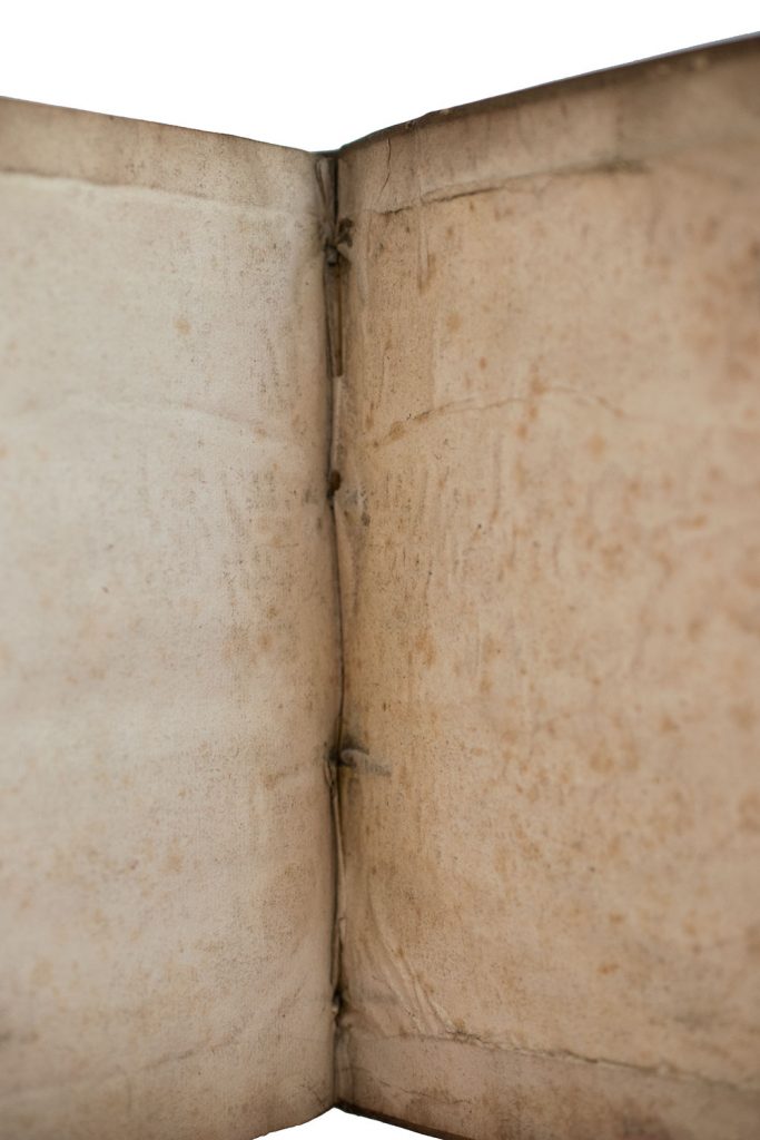
At the top and bottom, the stitching is in part exposed where it has pulled through the pastedown, but you can see that at least some of the thread remains sandwiched between the glued-down pastedown and the parchment cover. Here’s a detail of the bottom section:
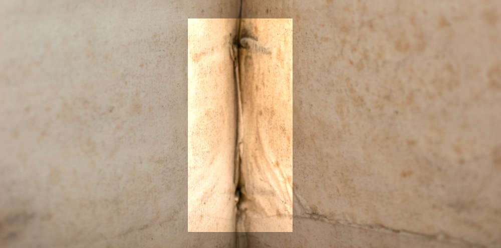
When the book was first put together, the stab-stiching would have been almost completely hidden from view. Hybrid structures can fail, and they can fail in ways that cause severe damage to the inner margins of leaves, but most hybrids would have been functional and pretty sturdy in their time. A hybrid volume was one that could look and mostly behave like a standard sewn book without the time commitment required for attaching each and every one of the quires onto supports more or less separately. (I write “more or less separately” because there were corner-cutting techniques available that allowed binders to sew multiple quires onto supports at the same time.)
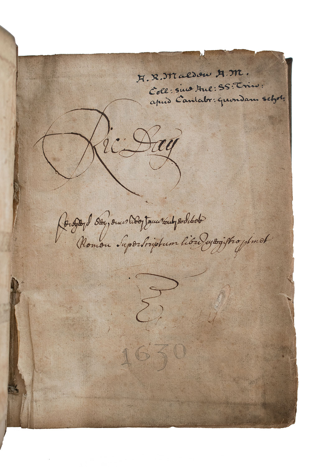
So, although I’ve just gone on about it a good bit, the hybrid status of the volume isn’t what I’m interested in here, per se. My main goal is instead to explain the presence of the blank free endleaf pictured at the top of this post, in the featured image—the blank free endleaf where Richard Day and Arthur Russell Malden have claimed ownership. As you could probably guess, that endleaf is at the very front of the book.
Seems straightforward enough, yeah? You might be thinking, Surely, Aaron, I’m not reading this just for you to tell me that some books had blank endpapers that people wrote on, right? Right. Here’s where things get atypical:
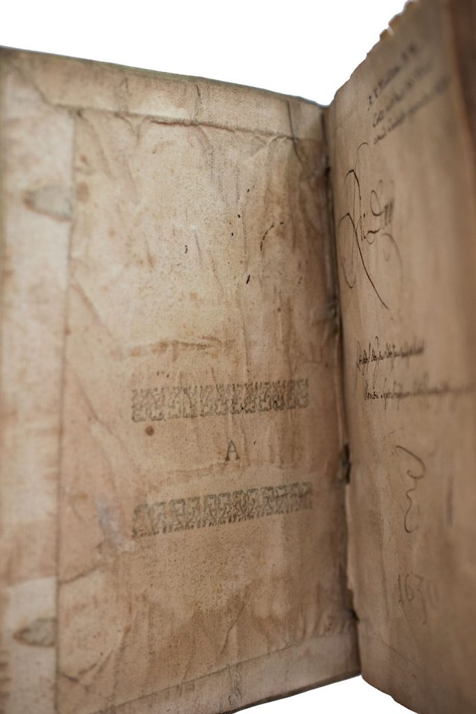
The front pastedown is the very first leaf in the A gathering of the first work in the volume, The compleat parson. The printing ink you can see in the picture faces the parchment—we’re seeing show-through. At a basic level, I think it’s kind of cool to see what is known as an “integral blank” used to form a pastedown, but when I first saw images of this book, I was most interested in the truly blank leaf next to the pastedown, the one with the inscriptions on it. The compleat parson does begin with a so-called “blank” that has a large “A” on it between two rows of ornaments, but that second leaf is supposed to be the title page, A2, and, sure enough, the leaf after the title-page in this copy has “A3” at the bottom. Just to be sure, I shined my Cliplight though A3 and the title page and was able to confirm that the two leaves are conjugate as they should be. Our blank endleaf, it turns out, is an added interloper.
In the case of the second and final work in this volume, Star-Chamber cases, the text proper ends on the recto of H3, with H4 being a blank leaf that has no printing on it. Below, you can see the blank verso of H3 on the left and book’s rear free endleaf on the right. Unlike in the front of the book, where the free endleaf has been added, here we’re indeed dealing with that integral blank, H4:
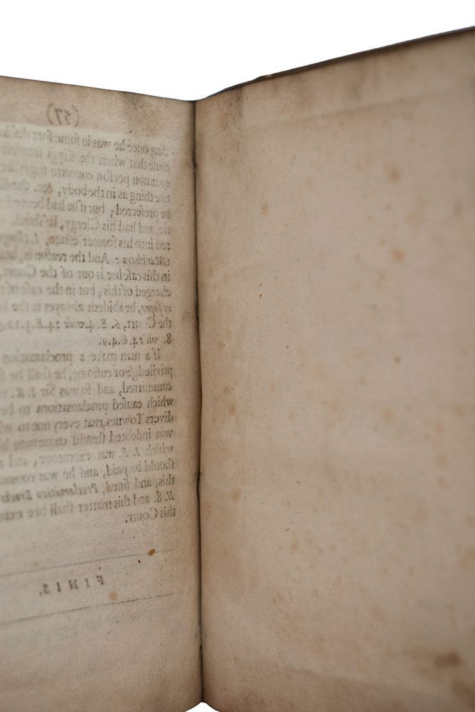
Turning over that blank H4 gets us back to the rear pastedown:

Here, the pastedown and not the free endleaf is the one that’s been added. This would have been the easiest way to go: the binder (or maybe an apprentice or family member) folded up the sheets that are part of Star-chamber cases, put them in order, and then tacked on a single quarto-sized leaf at the end.
In the front, on the other hand, the person did something that’s not quite as obvious: at some point in the process of folding and putting the sheets of The compleat parson in order, they inserted a single blank leaf into the A gathering. With Star-chamber cases placed after it, they or someone else in the shop then stab-stitched away. Going with a stab-stitched structure in general made it pretty easy to add in extra leaves: you could just put them in place, stab, and then stitch, with no need to create a spine fold for sewing or use adhesive to attach it to an adjacent leaf.
That said, putting the extra leaf in the front between A1 and A2 may have been at least a tiny bit more inconvenient than adding the pastedown at the very end. Before the edges of the leaves were trimmed to a uniform size after they’d been stab-stitched together, A1 and A2 were joined to each other by a fold at the top edge. This wouldn’t have created a major problem, of course, but would have meant that the inserted leaf needed a top edge that was already sufficiently perpendicular to the edge facing the spine so it could fit in fairly snugly—unless, that is, the binder opened the fold between A1 and A2 before inserting the leaf. Either way, getting a properly blank free endleaf at the front required a little more effort.
How then to explain the difference in practice at the front and the back? It’s pretty easy, I think: someone wanted a truly blank free endleaf at the front of the book and not the not-so-blank printer’s blank that came with The compleat parson. We see evidence in this book of a bookmaker modifying their practice for an aesthetic reason, one that may run slightly at odds with what we’re increasingly being told about premodern binding practices and aesthetic tolerances. Yes, it’s absolutely true that early modern readers were used to seeing recycled endleaves and covers with printed and/or manuscript texts all over them. But it’s also true—and worth pointing out, I think—that sometimes early modern readers preferred a clean appearance of the kind we take for granted in today’s bibliographical landscape.
