All posts filed under “Quires & Clasps

Paper Pitfalls

The other day, I presented to a group of The Bibliographical Society of America‘s very generous donors about four copies of the earliest known quarto edition of Christopher Marlowe’s The Jew of Malta (London: Nicholas Vavasour, 1633). This post is to atone for I sin I made in the course of that talk: I showed a reconstruction of a printed sheet that I mistakenly included instead of another and that is straight up wrong. When I sat down to blast out the talk itself a month or so after doing most of the research for it, I’d somehow completely forgotten that I’d noticed my error at that earlier date, corrected my thinking with some additional analysis, and made some new images—ugh. On the plus side, the error presents an opportunity for me to think through some useful bibliographical methods with a broader audience.

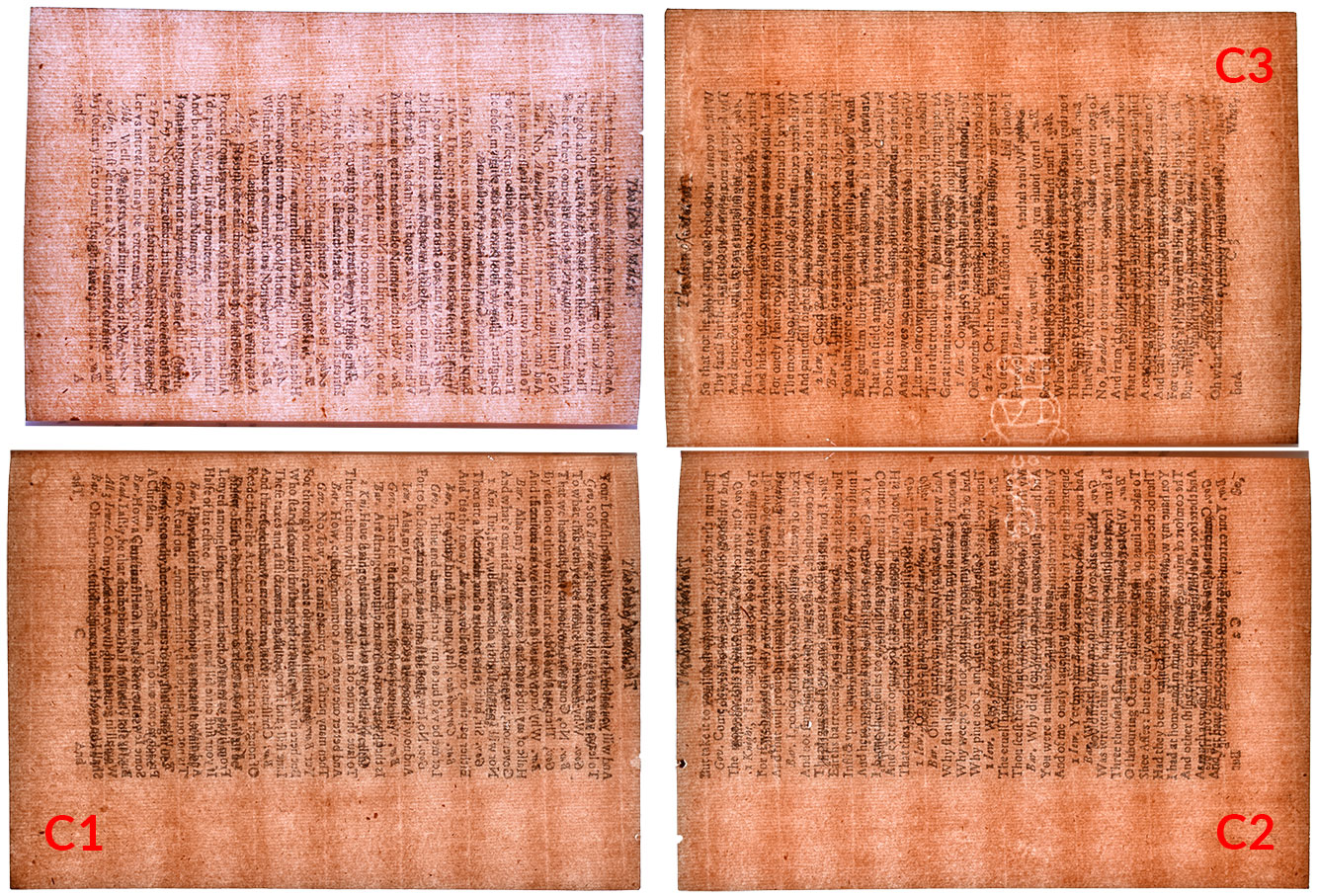
I discussed the Malta copies I discussed because all four are associated with the bibliophile Thomas J. Wise. He’s most famous for forging a series of 19th-century pamphlets, but weird things also happened when he engaged with authentic early editions. Most shockingly, Wise—or conceivably an accomplice—stole a number of leaves out of early English playbooks in the British Museum’s (now British Library’s) collection for the purpose of filling gaps in copies that he (a) kept for himself, (b) sold to an American collector, John Henry Wrenn, and (c) worked with English collector, George Atherton Aitken, to build. In addition to stealing leaves to complete so-called “imperfect” books, he also moved existing leaves between copies, usually reserving what he considered the best example in the group for his own playbook and then using another for Wrenn’s. He supplied copies to and/or exchanged leaves with Aitken, too. The results were one copy with five missing leaves—the British Museum’s copy once owned by actor David Garrick—and three that are Frankensteins, with each pair of covers bringing together leaves from what were originally three different copies. Wild.

Bibliographer and then British Museum librarian, David Foxon, worked with Fannie Ratchford and then William Todd at The University of Texas to figure all of this out. Their painstaking analysis, which looked at different types of evidence—leaf measurements, repairs, impressions on adjacent leaves from paper imperfections, holes from previous pamphlet stitching, insect damage, edge coloring, and watermarks and chainlines—determined when leaves were out of place and identified them as having originated in one of four source copies, designated A, B, C, and D.

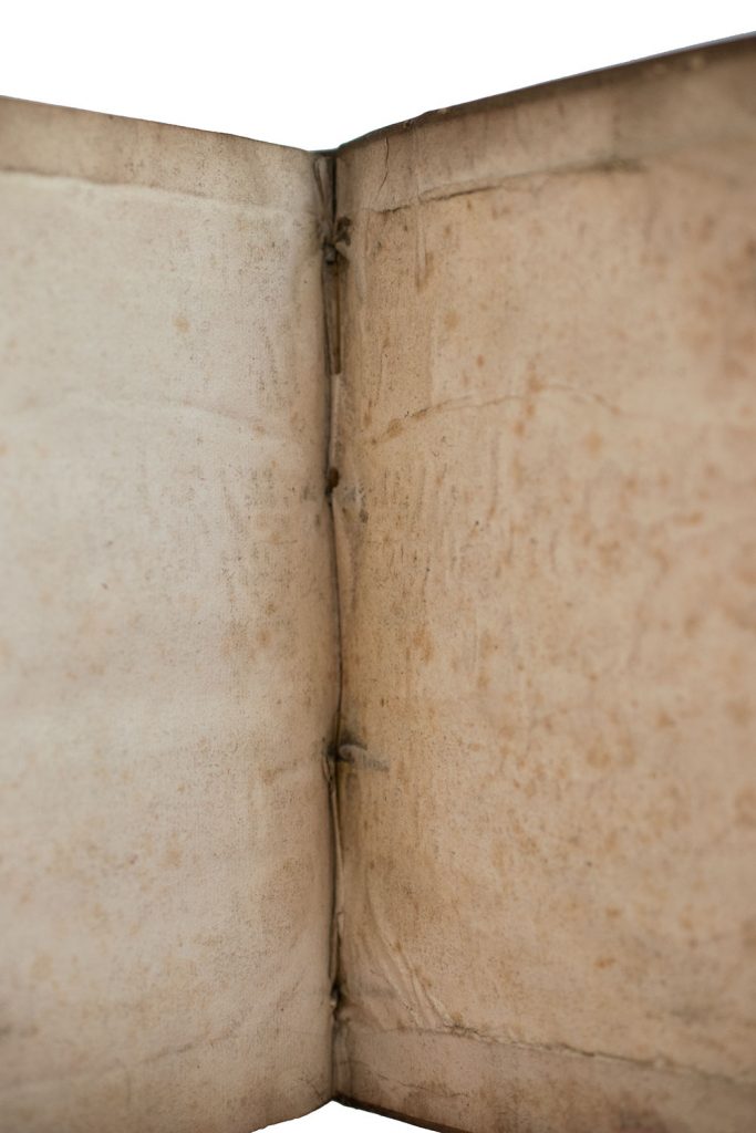
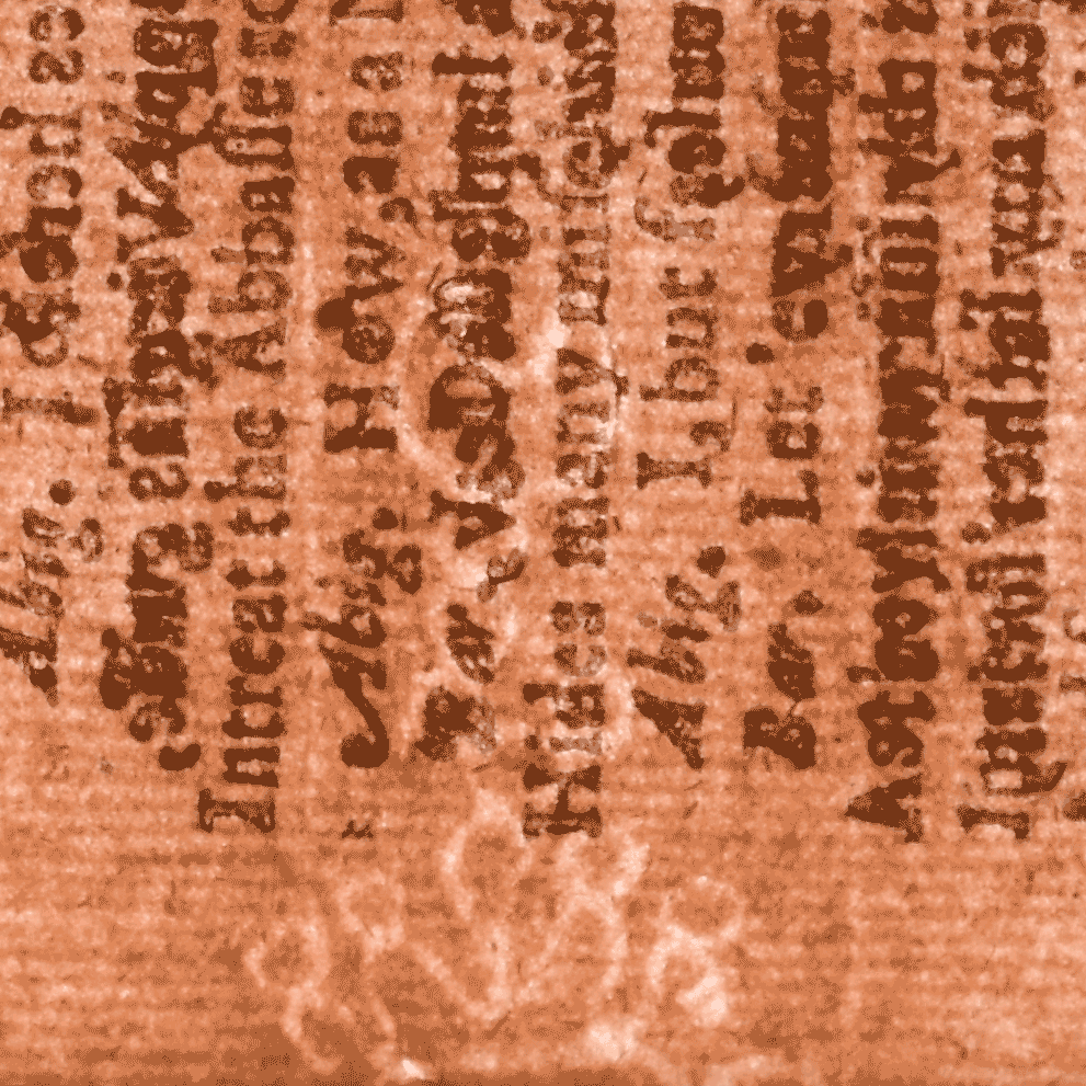
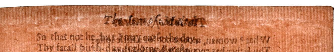
As part of my talk, I showed one of the stolen Garrick leaves as it now exists in Wrenn’s Wise-supplied Malta: the very final leaf of the edition. If you look very carefully and with the aid of a light sheet, you can see that there was a hole in it, right next to the “FINIS” at the very end. That hole was then almost seamlessly patched by Riviere and Son, the London-based bookbinding firm that Wise and Wrenn used, with another piece of compatible paper; the vertical wire lines mostly match up. The missing text on the recto was then supplied in pen facsimile:

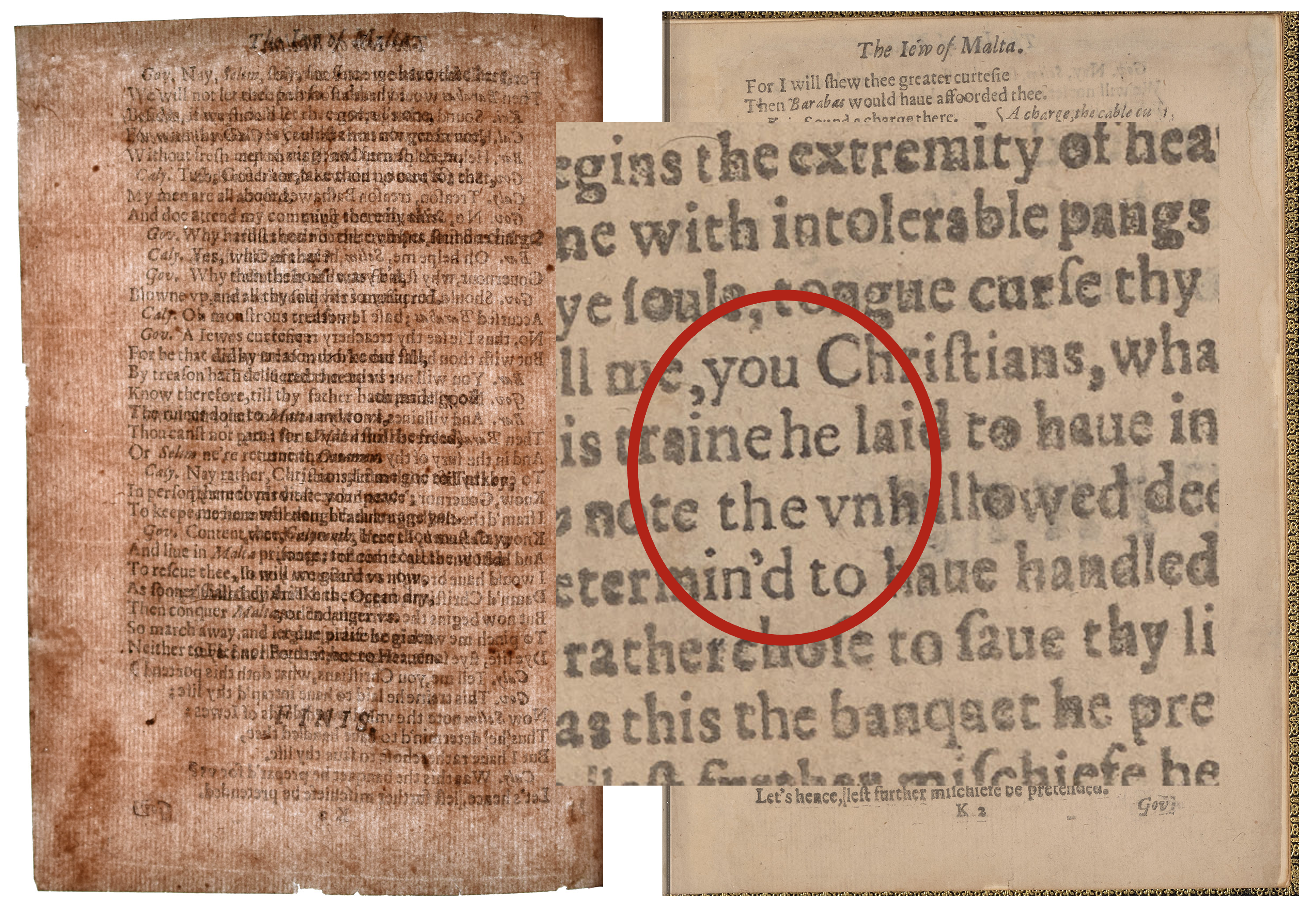
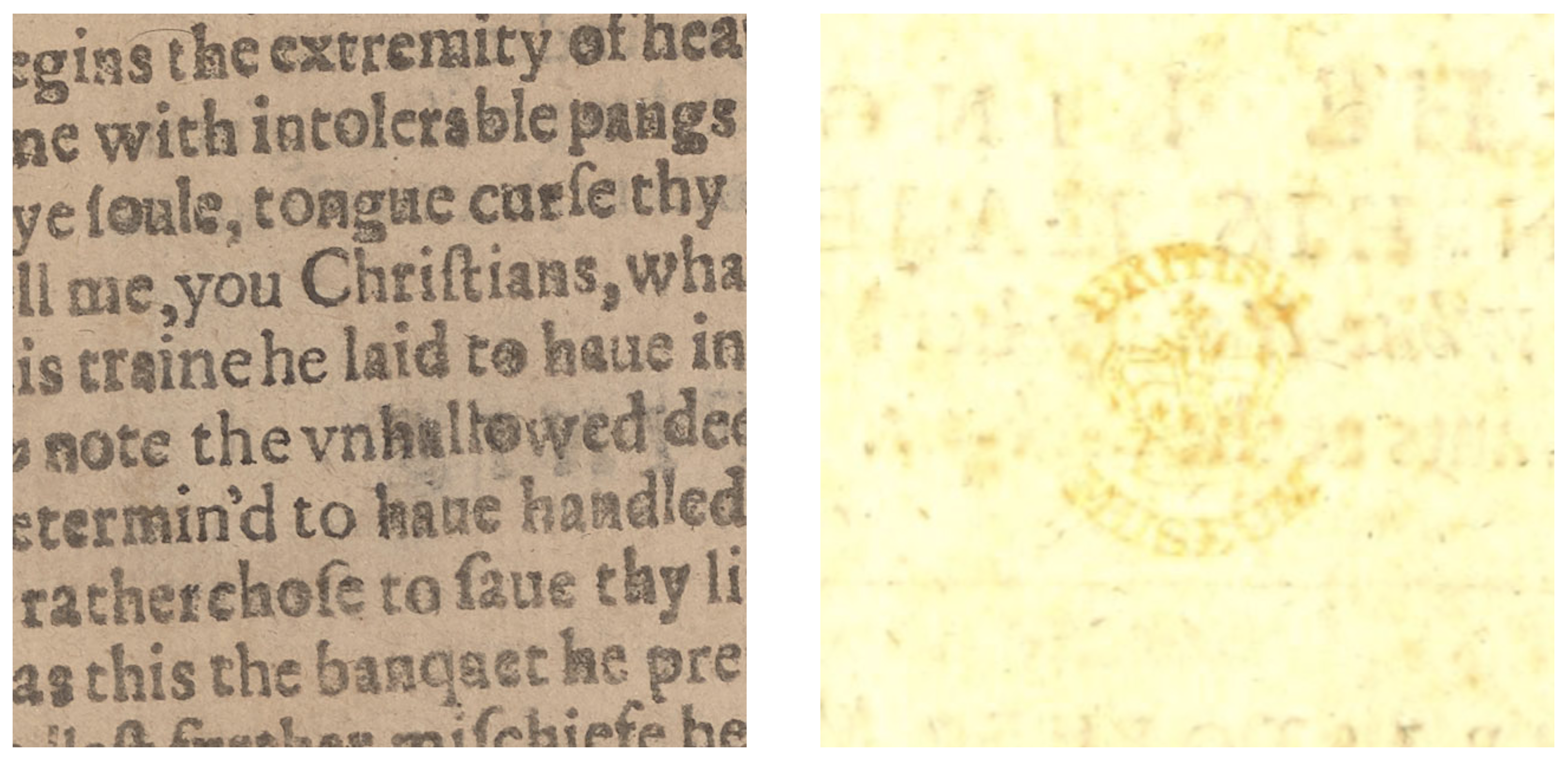
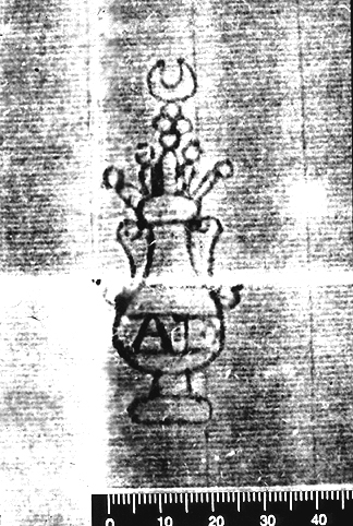
But why on earth was there a hole in the middle of the page? Well, the British Museum liked to stamp title-pages and final pages with security stamps, ones designed to dissuade theft. On the right, below, is a bad image of the British Museum stamp that remains on the title-page verso of the Garrick Malta. My two images aren’t quite to scale, but the patched hole in the K2 leaf now in the Wrenn Malta almost certainly arose from a British Museum stamp being surgically excised to hide the leaf’s source. To hide the theft. (If you want to read more about the wizardry of binders like Riviere and Son, check out my essay in Collated & Perfect.)

Because both the Wrenn Malta and the Garrick have been digitized as part of IIIF-compatible online repositories, I was able to create a custom manifest that allows us to reassemble the Garrick copy for the first time in well over a century:

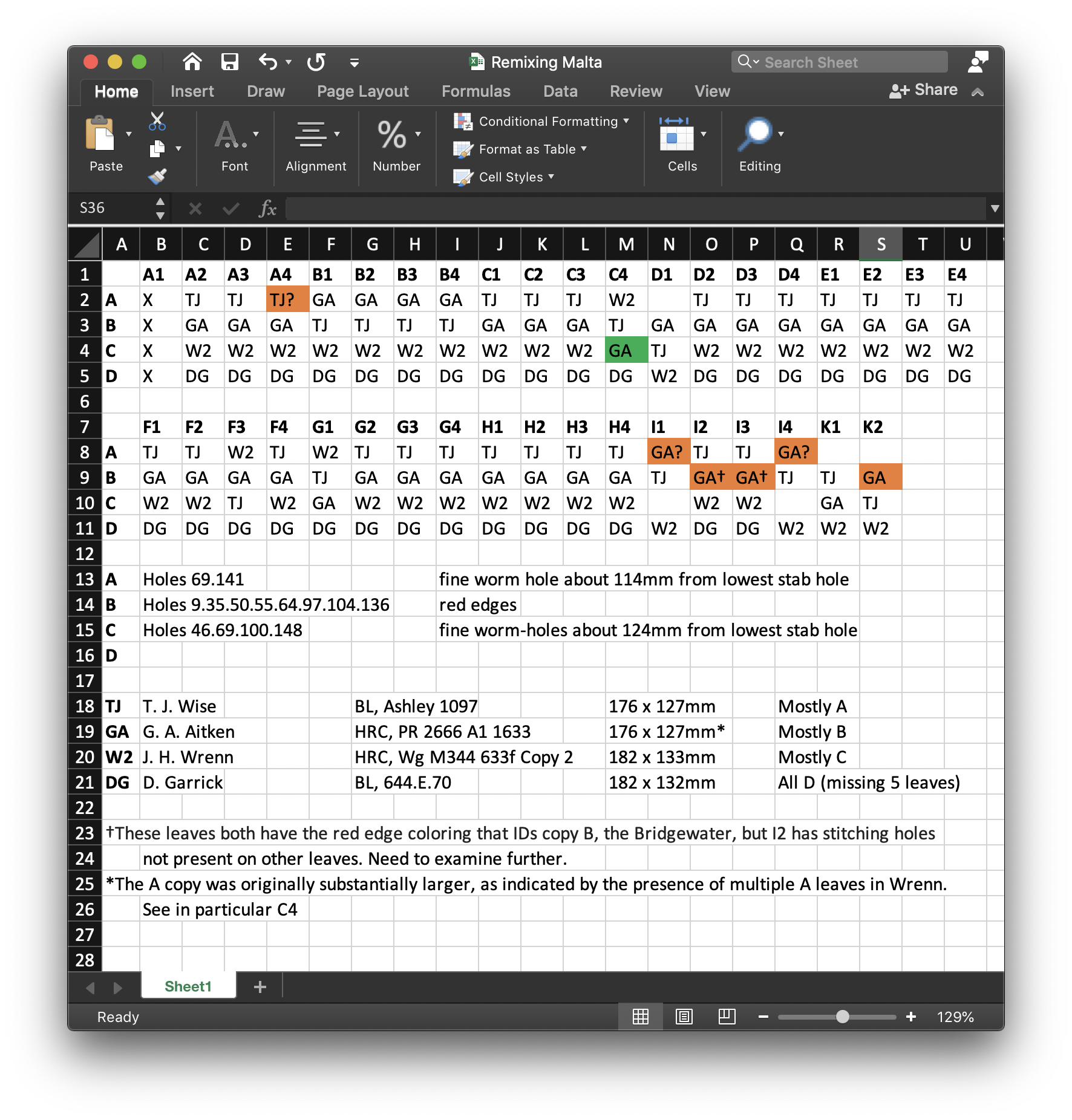
Neat. OK, but as I mentioned, the three main copies of Malta that Wise handled—really, built—involved leaf substitutions beyond ones from the Garrick. Here’s my working table based primarily on the analysis undertaken by Foxon, Ratchford, and Todd:

In two articles, Foxon (1959) and then Foxon and Todd (1961) produce individual charts for the Wise, second Wrenn, and Aitken copies as they now exist, recording which of the four original copies each of their leaves is from. Instead, because I’m interested largely in being able to reconstruct those original copies, I’ve created a single table that makes it easier to track the whereabouts of their leaves. My columns refer to each leaf in the edition—none of the copies has A1; the title-page is A2; the final leaf is K2—and the four rows refer to each of the original four Malta copies by the letters Foxon assigned them. I’ve then populated each cell with a two-letter label identifying the copy in which the leaf currently resides.

You’ll see that the leaves of copy D are all in the Garrick copy (DG) except for the five that were stolen and used in the Wrenn (WR). You’ll see, too, as I also indicate toward the bottom, that Wise’s own copy (TJ) is mostly made of leaves from the A copy; Aitken’s (AK) mostly from the B; and Wrenn’s mostly from the C. You’ll also notice a few completely blank cells: they appear only in columns representing leaves that were stolen out of the Garrick, as there were only three copies of those leaves to go around—or, at least, only three copies that Wise thought could be made to pass muster in his and his collector buddies’ copies. And then you’ll find orange cells with copy assignments that I’ve qualified with question marks. In the Foxon and Foxon and Todd articles, there’s a hand-toss when it comes to the seven leaves in orange: one now in Wise’s copy, A4, and then six that are now in the Aitken: C4, the four leaves of the I sheet, and then K2. The articles print simply that those leaves are “unassigned.”

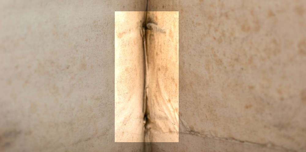
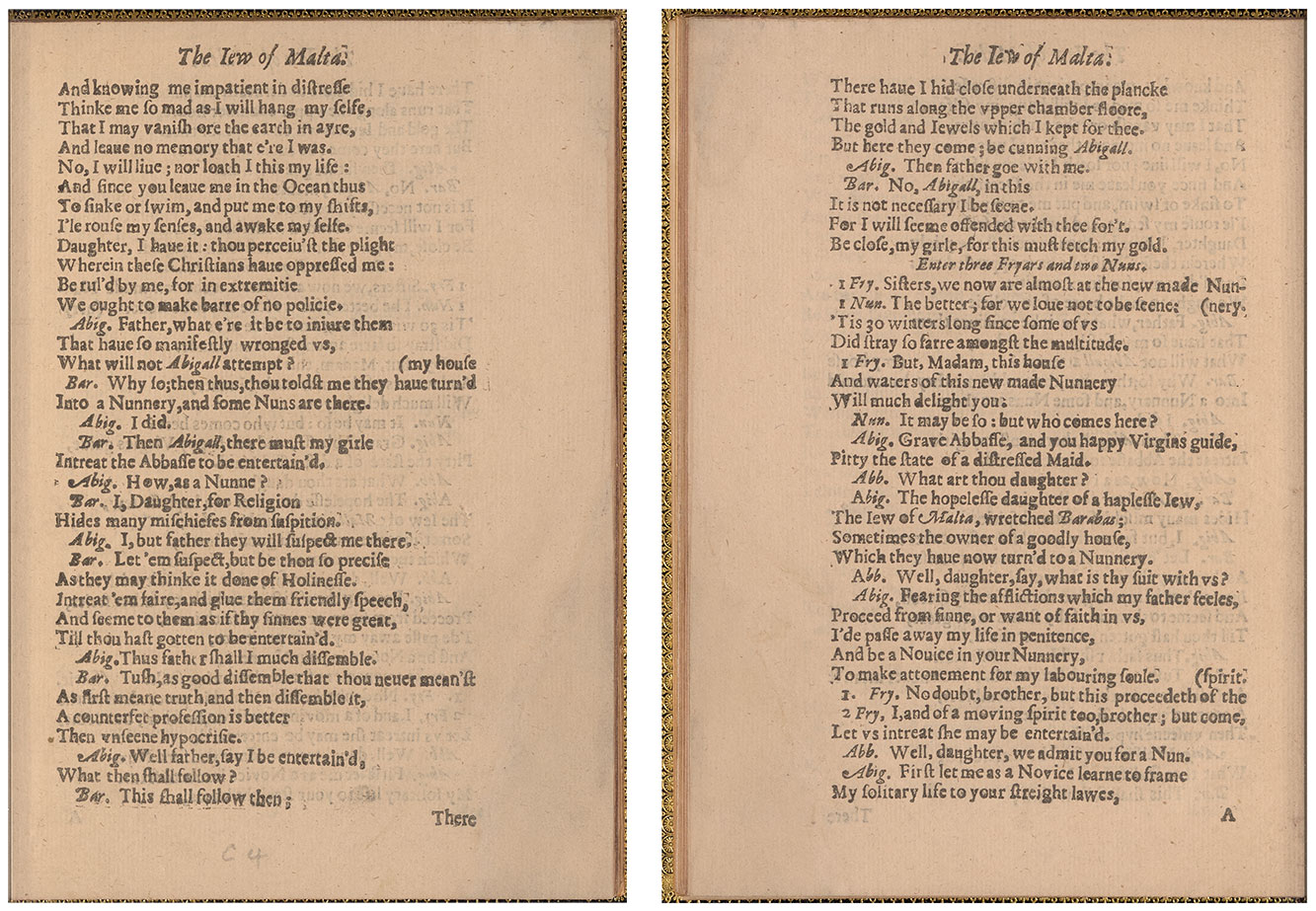
I initially made my own assignments—tentative ones, hence the orange cells and the question marks—simply by process of elimination: if we don’t assume the existence of any copies not already in evidence, then there aren’t any other possibilities. Still, with both the Wrenn and Aitken copies not far from my office in the Ransom Center, I wanted to see if I could find evidence that Foxon et al. hadn’t noticed that could lock down the Aitken assignments. For the purposes of my BSA talk, I decided to focus on C4. Here it is in the second Wrenn copy, both sides:

It looks like a pretty clean, uniform, leaf, yeah? Well here it is with a light sheet behind it:

Check out those outer corners—the one at top-right, in particular, will become relevant shortly. What you’re looking at is more of Riviere and Son’s expert grafting. This time, though, you can see that, while the wire lines in both the base leaf and the repair pieces pretty well match, the chainlines do not. Here, it’s easier to see that we’re dealing with non-original paper that’s been added.

If you scroll back up to my table, you’ll see that Foxon assigned C4 in the Wrenn copy to what was once copy A and that the three other C leaves in Wrenn belonged to copy C. There are a number of pieces of evidence that led Foxon to these conclusions, but in this instance we can tell there’s a basic problem in the Wrenn copy by assembling backlit photos of each C leaf into what they would have looked like if originally from a single, full sheet of paper:

If you’ve read your preferred introduction to bibliography that covers European papermaking practices, you’ll know that sheets typically have either a single watermark positioned in the middle of one side of the sheet or a watermark in that position plus a distinct countermark in the middle of the other side of the sheet. On the right side, here, all seems well: we have a very typical pot watermark that, when we account for trimming when binding, is in the middle of that side of the sheet, traversing what became the inner margins of leaves C2 and C3 when the sheet was folded.

So you can get a sense of just how much of the mark we lose in the gutter and to Riviere and Son’s trimming, here’s a two-handled pot watermark with “AD” across its belly that’s very similar to what we see in Malta. It’s from the Gravell Watermark Archive and has been dated to 1634, the year after our playbook edition:

Back to my sheet reconstruction: on the left side, we’ve got a problem. On C1, we don’t see anything peeking out from the inner margin, which is what we’d expect. (That said, always be careful when ruling out the presence of a mark: tight or cropped inner margins sometimes obscure or remove them, and sometimes marks just don’t appear perfectly in the middle of the sheet. Especially in a bound volume, it’s possible for more compact watermarks than this pot to appear in only one of the two leaves you’d expect.) But look at C4—we see the top of a pot again, the same top we see, flipped, on C2. The absence of a mark on C1 can’t tell us for sure that it once belonged with C2 and C3, but that extra flipped pot top can indeed rule out C4 as having originally belonged with any of the other leaves, C1–3.

When I made this reconstruction, I also made one of the Aitken copy’s C sheet, which Foxon and Todd said was similarly sophisticated: C1–3 from the base copy, B; C4 from somewhere else. Here it is:

With this, we can also say that there’s a problem with C4: it definitely is not from the same sheet as C1—this pot mark is pretty tall—and, because I’m reasonably sure that there was no unmarked paper used in the Malta edition, it is almost definitely not from the same sheet as C2 and C3, either.

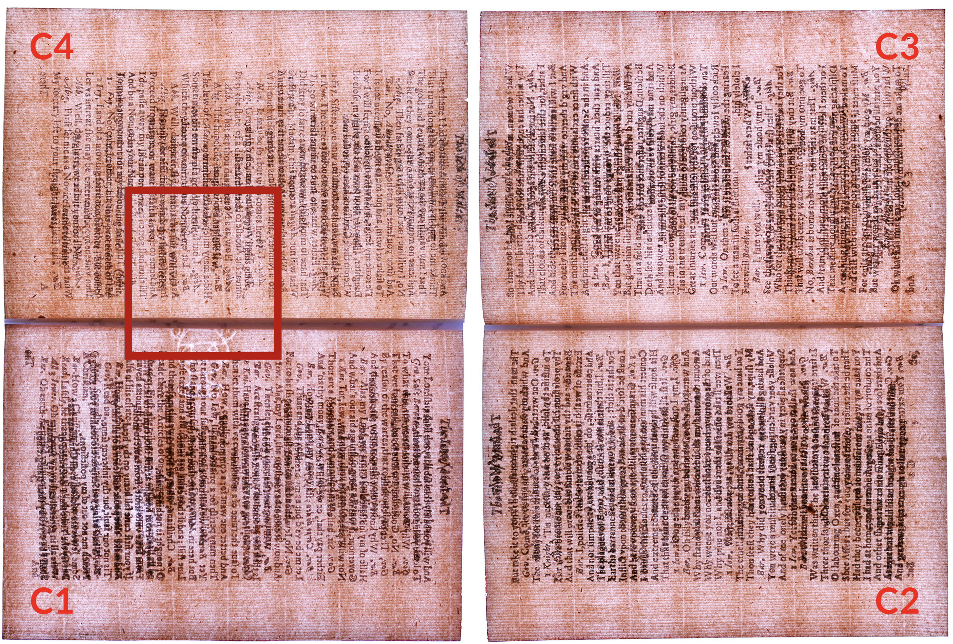
And this is where I initially did something without looking back at my chart and at Foxon’s explanation of the evidence he used to assign Malta leaves to particular copies. I was mistakenly thinking that the Wrenn leaf was the unassigned wildcard, not the Aitken and, so, made the reconstruction that’s the featured image at the top. Well, the same image except for the fact that I felt I had a match. This is the version I showed in my talk:

Doesn’t it look, at least at first glance, like we have a nice match? The chainlines all traverse the inner margins of C1 and C4 pretty nicely while still keeping the pages’ headers in line, and the watermark stacks well: minus what’s lost in the gutters and to whatever inner-margin trimming Riviere and Son did, we appear to have a pot in the right position. As I realized upon further consideration, though, we’re looking at a mirage.

In his account of Wise’s copy, Foxon noticed that a number of leaves in it—A2–3, C3, G4, H3, and I3—have been “restored at the outer top corner.” In my backlit photos, we see such a restoration to the Wrenn C4, too, and Foxon’s assignment of that copy to A, the base copy of the Wise, appears to have been made in part because of it. Now we can make sense of the featured image at the top of this post:

This example serves as a helpful reminder that sheets of paper made at the same time from the same mould are going to look very similar—essentially identical when it comes to wire lines, chainlines, and watermarks (at least until the wires used to form the watermark start to detach or otherwise shift around). For example, I am reasonably confident that the C sheets from the A and C copies were indeed made from the very same mould. Here, for one piece of evidence, is a GIF comparing the top of the watermark as visible in C4 in the Wrenn, from A, with the top of the watermark as visible in C2 of the Wrenn, from C. It would be very hard for marks from two different moulds to match this closely:

So, while sheets could go through the press in one of four orientations relative to the forme being printed, and while printers didn’t stick sheets onto the tympan in exactly the same position each time, there’s still a pretty decent chance of ending up with a false match when trying to reconstruct sheets—as in my mistake above. Caveat (digital) bibliographer.

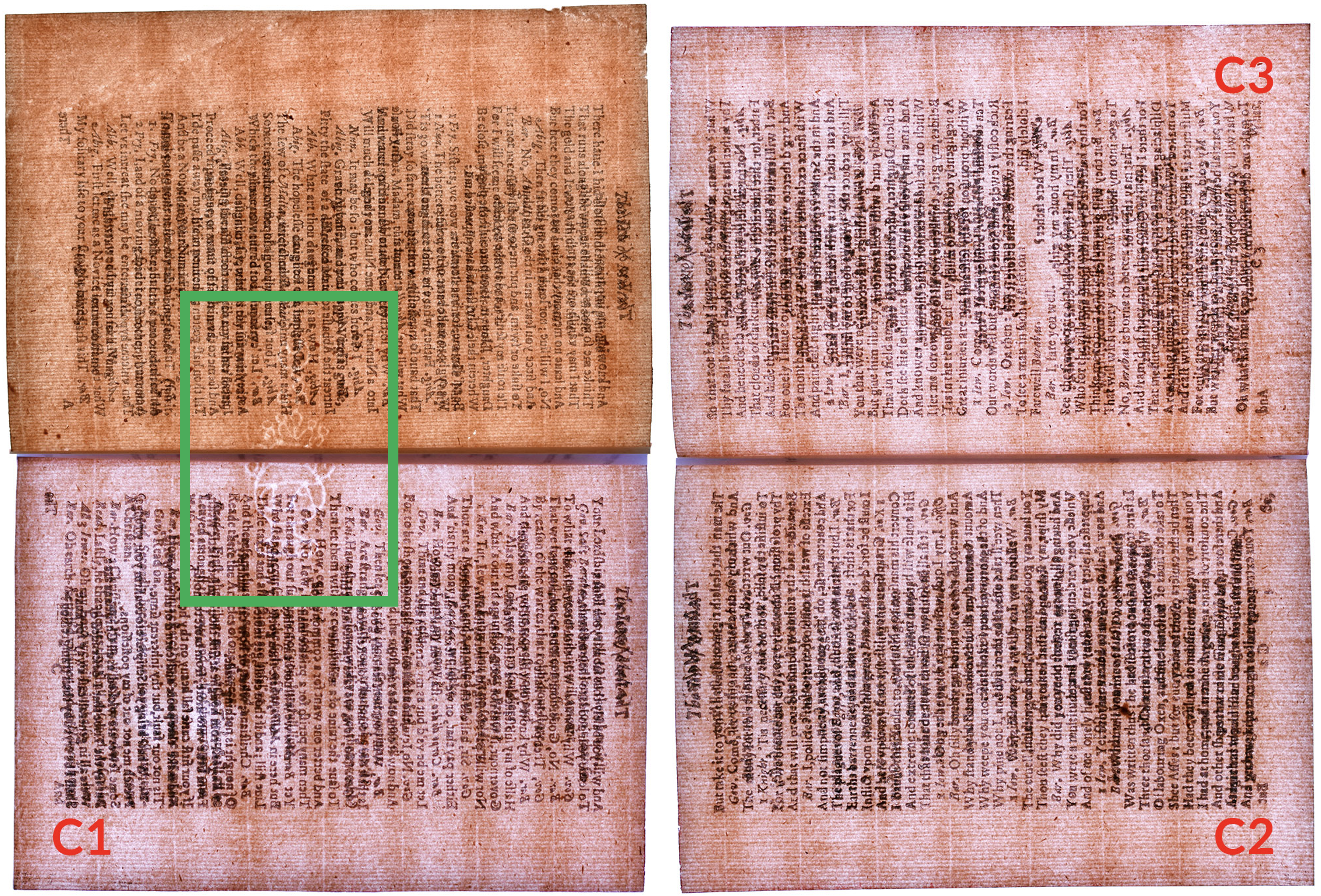
The reconstruction I should have made based on my table is this one, which joins the copy of C4 in Aitken with C1–3 in the Wrenn:

While this in all likelihood is the correct reconstruction, it probably doesn’t look as convincing as the one that’s wrong and can’t on its own give us a guarantee, for the reason I just mentioned. The most it really allows us to say is that C4 is compatible with C1–3. Well, that’s not entirely true: one incidental benefit of this image is that it helps us see that none of the individual leaves have much if any paper above the printed headers—or, in the case of C3, had before Riviere and Son got their hands on it. Wise apparently deemed that leaf’s cropping severe enough that he had it extended at the top:

After the new (to this copy) paper was grafted on, what were once acephalous letters were completed in pen facsimile. Check out the two pages of the leaf photographed with normal lighting in the Ransom Center’s cover-to-cover facsimile of the Wrenn copy. Then look at all of the leaves that are from copy C as designated by my table. If you keep an eye out for additional evidence of remargining at the tops of A2–3, G2, and H3–4, you’ll notice that heavy cropping of the top margin combined with otherwise healthy margins is a consistent feature of C leaves:

Importantly, too, it is not a consistent feature of the other base copies. You can compare with the A and B leaves in Wrenn as well as with those in the rest of Aitken:

All said, I think I can feel pretty confident about assigning C4 in the Aitken to copy C for three reasons:

  1. Process of elimination: we know where all of the other Malta C4s Wise is known to have handled ended up.
  2. Sheet reconstruction: the Aitken C4’s lack of a mark and particular chainline spacing make it possible that it was once part of the same sheet as C1–3 in Wrenn, which are C leaves.
  3. Upper-margin trimming: the Aitken C4 has nearly zero space above headers, which connects it with C leaves and not A or B leaves. (C4 in the Garrick, the source of D leaves, remains undisturbed.)

I suspect that, with additional analysis, I could strengthen the case even further. In any case, here’s what we get after all that work—a new chart with one orange cell now turned green, the question mark removed:

Bibliography, man.

Front free endleaf from sammelband of 1630 John Grove editions

Sometimes You Want Your Blank Blank

Front cover of sammelband of 1630 John Grove editions

From the outside, this looks like a standard parchment binding. As the inscription on the cover indicates, it brings together two different titles. Yes, it’s what book types call a sammelband. John Grove published both editions in 1630:

In the picture of the front cover, you can see the stubs where there were once two alum-tawed ties at the fore edge, just as you’d expect. (Silk ties would have been another possibility.) And you can see on the left that the parchment case is attached to the bookblock with alum-tawed strips at four points in the front, and if you turned the book over, you’d see that the same four strips are also laced in at the back—again, just as you’d expect.

The main reason I own this book, though, is that the quires inside haven’t been bound, if by “bound” we mean sewn through the folds onto a series of supports. Instead, this is what I call a hybrid structure: the 86 leaves that make up the bookblock have been stab-stitched together at four points, and what look like traditional sewing supports from the outside pass straight through the bookblock just as the stab-stitching does. You can see part of the stitching and a couple of the alum-tawed thongs in the featured image at the top of this post. As in a standard parchment binding, the covers are laced on, but as in an early modern pamphlet, it’s stab-stitched and not sewn. The combination makes it a hybrid, and hybrids were very common in the period. In fact, they appear to have been just as common as sewn bindings when it came to English quartos that weren’t especially thick. If you’ve spent a decent amount of time working with early English books in special collections libraries, there’s a good chance you’ve come across one of these and not noticed.

As in many examples of hybrids I’ve seen, this one has pastedowns, and the pastedowns are attached to the bookblock by the volume’s primary stab-stitching. You can see this pretty well at the back:

Added blank pastedown in sammelband of 1630 John Grove editions

At the top and bottom, the stitching is in part exposed where it has pulled through the pastedown, but you can see that at least some of the thread remains sandwiched between the glued-down pastedown and the parchment cover. Here’s a detail of the bottom section:

Stab-stitching pulling through rear pastedown in sammelband of 1630 John Grove editions

When the book was first put together, the stab-stiching would have been almost completely hidden from view. Hybrid structures can fail, and they can fail in ways that cause severe damage to the inner margins of leaves, but most hybrids would have been functional and pretty sturdy in their time. A hybrid volume was one that could look and mostly behave like a standard sewn book without the time commitment required for attaching each and every one of the quires onto supports more or less separately. (I write “more or less separately” because there were corner-cutting techniques available that allowed binders to sew multiple quires onto supports at the same time.)

So, although I’ve just gone on about it a good bit, the hybrid status of the volume isn’t what I’m interested in here, per se. My main goal is instead to explain the presence of the blank free endleaf pictured at the top of this post, in the featured image—the blank free endleaf where Richard Day and Arthur Russell Malden have claimed ownership. As you could probably guess, that endleaf is at the very front of the book.

Seems straightforward enough, yeah? You might be thinking, Surely, Aaron, I’m not reading this just for you to tell me that some books had blank endpapers that people wrote on, right? Right. Here’s where things get atypical:

"Blank" initial leaf, sig. A1, of A Compleat Parson (London: John Grove, 1630)

The front pastedown is the very first leaf in the A gathering of the first work in the volume, The compleat parson. The printing ink you can see in the picture faces the parchment—we’re seeing show-through. At a basic level, I think it’s kind of cool to see what is known as an “integral blank” used to form a pastedown, but when I first saw images of this book, I was most interested in the truly blank leaf next to the pastedown, the one with the inscriptions on it. The compleat parson does begin with a so-called “blank” that has a large “A” on it between two rows of ornaments, but that second leaf is supposed to be the title page, A2, and, sure enough, the leaf after the title-page in this copy has “A3” at the bottom. Just to be sure, I shined my Cliplight though A3 and the title page and was able to confirm that the two leaves are conjugate as they should be. Our blank endleaf, it turns out, is an added interloper.

In the case of the second and final work in this volume, Star-Chamber cases, the text proper ends on the recto of H3, with H4 being a blank leaf that has no printing on it. Below, you can see the blank verso of H3 on the left and book’s rear free endleaf on the right. Unlike in the front of the book, where the free endleaf has been added, here we’re indeed dealing with that integral blank, H4:

"Blank" final leaf, sig. H4, of Star-Chamber Cases (London: John Grove, 1630)

Turning over that blank H4 gets us back to the rear pastedown:

Added blank pastedown in sammelband of 1630 John Grove editions

Here, the pastedown and not the free endleaf is the one that’s been added. This would have been the easiest way to go: the binder (or maybe an apprentice or family member) folded up the sheets that are part of Star-chamber cases, put them in order, and then tacked on a single quarto-sized leaf at the end.

In the front, on the other hand, the person did something that’s not quite as obvious: at some point in the process of folding and putting the sheets of The compleat parson in order, they inserted a single blank leaf into the A gathering. With Star-chamber cases placed after it, they or someone else in the shop then stab-stitched away. Going with a stab-stitched structure in general made it pretty easy to add in extra leaves: you could just put them in place, stab, and then stitch, with no need to create a spine fold for sewing or use adhesive to attach it to an adjacent leaf.

That said, putting the extra leaf in the front between A1 and A2 may have been at least a tiny bit more inconvenient than adding the pastedown at the very end. Before the edges of the leaves were trimmed to a uniform size after they’d been stab-stitched together, A1 and A2 were joined to each other by a fold at the top edge. This wouldn’t have created a major problem, of course, but would have meant that the inserted leaf needed a top edge that was already sufficiently perpendicular to the edge facing the spine so it could fit in fairly snugly—unless, that is, the binder opened the fold between A1 and A2 before inserting the leaf. Either way, getting a properly blank free endleaf at the front required a little more effort.

How then to explain the difference in practice at the front and the back? It’s pretty easy, I think: someone wanted a truly blank free endleaf at the front of the book and not the not-so-blank printer’s blank that came with The compleat parson. We see evidence in this book of a bookmaker modifying their practice for an aesthetic reason, one that may run slightly at odds with what we’re increasingly being told about premodern binding practices and aesthetic tolerances. Yes, it’s absolutely true that early modern readers were used to seeing recycled endleaves and covers with printed and/or manuscript texts all over them. But it’s also true—and worth pointing out, I think—that sometimes early modern readers preferred a clean appearance of the kind we take for granted in today’s bibliographical landscape.

STC 2875, sig. Bb8v

The Trouble with Translation (w/ Errata)

2011 marked the quadricentennial of the King James Bible’s first edition, and it saw the publication of entirely too many books and essays on English Bibles. For one of these, Hannibal Hamlin and Norman W. Jones’s The King James Bible After 400 Years: Literary, Linguistic, and Cultural Influences (Cambridge: CUP, 2011), I contributed to the madness in the form of a chapter I coauthored with John N. King: “The Materiality of English Printed Bibles from the Tyndale New Testament to the King James Bible.” The title is more than a mouthful, and the chapter itself may not make for the most exhilarating read—there’s a lot of detail—but writing it proved very important to my own development as a scholar. In fact, the research that went into it was, perhaps more than anything else, what got me into both “hardcore” technical bibliography and the history of the English book trade. Because of this, I have long been thankful that John trusted me, a lowly MA student at the time, to take on the project with him. The skills I began to develop while writing the chapter have paid dividends.

I remain proud the 2011 chapter itself, too, but it’s not perfect. (What piece of scholarship is?) Most significantly, I soon came to realize that the differences between early editions of the Bible and New Testament were so many that the prevailing paradigm of thinking about the history of the English Bible in terms of translation is woefully insufficient—especially if we want to understand how early modern readers actually interacted with Scripture. One response to this realization will be the new bibliographical resource that I have slowly been working on since. Titled BEME: Bibles of Early Modern England, it will provide authoritative records for Bibles and New Testaments published in the English language, records that include but move beyond basic bibliographical information and account for (virtually) every piece of paratext present. I am excited about the new research this resource will facilitate once it is online in the form of a free website.

After I had tabled work on English Bibles for several years to write a dissertation on drama, Thomas Fulton and Kristen Poole presented me with a timely opportunity to revisit my earlier research and gear up for serious work on BEME: they invited me to write a chapter for The Bible on the Shakespearean Stage: Cultures of Interpretation in Reformation Englandwhich is now out from Cambridge University Press. My contribution, “The Trouble with Translation: Paratexts and England’s Bestselling New Testament,” focuses on a line of octavo New Testaments that was in print from around 1553 until at least 1619. Known to its contemporaries as the “Cheke” New Testament, it was likely the single bestselling book of Scripture in English under three monarchs: Edward VI, Elizabeth I, and James I. And, yet, it is all but unknown today. Its title and title-page marketing, along with its paratexts, stay remarkably consistent, making it possible to identify as a distinct series, but the book has largely flown under the radar for two main reasons: 1) few have paid attention to specific Bible and New Testament product lines as such, and 2) it has been hard to see the Cheke Testament as a product line because the translation included in editions shifts from one to another around 1568, from the Tyndale to the Bishops’.

Naturally, I’d love for everyone to read the chapter. I think its local intervention in highlighting these specific New Testaments and its broader argument about the importance to early modern Christians of paratexts and the product lines they generated are both important. The centrality of translation in existing histories of the English Bible and in broader accounts of confessional identity in the period has created both blind spots and distortions. I’ll be totally honest, though: there are a few particulars that are either wrong or that I would now consider at least potentially misleading. A couple were proofing mishaps, and others, well, are just on me. So, in the spirit of an early modern printer (or just a slightly embarrassed scholar), here are some errata (with explanations) to accompany “The Trouble with Translation: Paratexts and England’s Bestselling New Testament”:

  • p. 35, l. 38: for “print” read “publish”. In this sentence, the published version says that Richard Jugge secured a patent to “print” New Testaments in English in 1551. This doesn’t create too much of a problem, because “print” in this context almost certainly means “cause to be printed” rather than “print when hired by someone else,” but I think it’s useful to be precise whenever possible. So-called printing patents issued by the State granted the recipient an exclusive right to publish a given title or class of books; patent holders had the ability to hire whomever they wanted to execute the actual printing.
  • p. 36, l. 14: for “printing rights” read “publishing rights”.
  • p. 37, l. 3: for “secured a license to print” read “secured a license to publish”.
  • p. 37, ll. 11–13 : Here, I write with confidence that Christopher Barker agreed to honor Richard Jugge’s monopoly on sixteenmo New Testaments and quarto Bibles when he began publishing Bibles and New Testaments himself because he “wanted to curry favor with the organization […] probably anticipating his future membership”. This speculation is almost certainly too strong: there are any number of possible reasons.
  • p. 37: l. 37: In 1584, Barker donated the right to publish new editions of the Cheke New Testament to the Stationers’ Company, “Provided that [he] himselfe print the sayde Testaments at the lowest value.” I write in the essay that the stipulation that Barker print any future editions means that he was still setting himself up for profit, but this may be misleading. Since the stipulation makes it clear that Barker had to take the jobs at a low rate—”the lowest value”—it may be that the Stationers’ Company itself asked him to agree in advance to printing editions because his large shop was the only one around that could comfortably tackle editions of the sizes that Cheke Testaments saw, which were apparently up to 6,000 copies. Barker’s team would still see work in these cases, and Barker himself would presumably still see a profit, but the reason for the stipulation may have been to ensure that those initiating new editions could get them printed, not to ensure that Barker still saw income from the book. Or maybe there’s some other backstory. I consider myself a careful scholar, but the attractiveness of an unambiguous narrative seduces even me on occasion.
  • p. 241, n. 24, l. 5: before the sentence beginning “On the messy issue”, add “Prior to 1559, though, Jugge did not print his own books; he served only as their publisher.” This relates to my first change: Jugge, with his patent under Edward and at the very beginning of Elizabeth’s reign, was only acting as a publisher. He contracted out the printing.
  • p. 43, ll. 6–7: for “by his final edition, from around 1575” read “by the mid-1570s”. What appears to have been Jugge’s final edition, STC 2875a ([c.1575]), drops the table. This and the following corrections are largely the result of having missed this edition.
  • p. 43, l. 2: for “Jugge editions” read “All but what appears to have been the final Jugge edition”.
  • p. 43, l. 8: for “Barker dropped this” read “Jugge eventually dropped this”.
  • p. 43, l. 35: for “in the Jugge editions” read “in all but the final Jugge edition”
  • p. 43, l. 38: for “Barker borrowed” read “Jugge ultimately borrowed”.
  • p. 242, n. 42, ll. 2–3: delete “Notably, it was introduced by Barker, not when Jugge first replaced Tyndale’s translation with the Bishops’ text.”
  • p. 242, n. 45, l. 1: for “STC 2875a” read “STC 2875a.5.”
  • p. 243, n. 49, l. 2: for “Editions with the Bishops’ text” read “Beginning with STC 2875a ([c.1575]), editions with the Bishops’ text”. In this note, I write that Cheke Testaments printed with the Tyndale translation employ an alphabet—A, B, C, D, etc.—to help divide chapters into citable chunks and those with the Bishops’ retain that system while adding in verse numbers. This isn’t entirely correct: although Richard Jugge introduced the Bishops’ translation to the series, it wasn’t until what appears to be his final Cheke edition that he added in the verse numbers; the other Bishops’ octavos include only the alphabet system. (The image above is from an earlier edition in the Cheke series with the Bishops’ translation: see, no verse numbers.)

* The featured image is from my personal (very ragged) copy of a Cheke New Testament published by Richard Jugge, probably at some point between 1573 and 1575 (STC 2875).